YONGKWAN KIM
KHvatec HEADQUARTERS
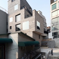
In 2010, when the architects were invited to the concept design phase, it was widespread that the area including the site would transform into a commercial zone (change in Floor-Area Ratio to occur: 250% -> 400%) within next 10 years. The client required three important factors into the design. First, the design should not stand out alone from the neighboring buildings, but still acquire the company's brand image. Second, to consider that it is IT related company therefore requires high-security, which limits openings. Third, to include a small theater and a gallery for the employees and the public in respect to cultural context that will continue from Seoul Art Center (note that Seoul Art Center is in close proximity of KHvatec Headquarters).
YONGKWAN KIM
With the above three requirements, there were two questions to be answered within the design. First was to ask "How can we provide a system with much flexibility that would respond positively to the future changes (in regards to floor to area ratio) that might occur?" And "How can this system coexist with the client's request of new typology of an office building and the application into the urban environment?" In response to these questions and request, the architects came to a conclusion of "facade structural net" system.
Current zone requires Floor-Area Ratio of 250%, and it would increase to 400% when the zoning changes in the future. And the remaining 150% would be achieved through utilizing the space between the skin and the structure through the floating deck system.
YONGKWAN KIM
On each floor, there are 2 floating decks which perform as a structural beam; also as an outdoor terrace for the office employees who work indoors more than 8 hours a day. As the decks do not overlap one another, it is excluded from the total-floor area and provides a visual communication. In addition, the office space is surrounded by a layer where it is not exposed too much and offers a higher level of security.
YONGKWAN KIM
The 'Shield Can Frame', one of the company's mobile items, was the motive in designing Facade Structural Net for the building. It was to represent the brand identity through configuration representation of the product. This arrangement also allows different identity of urban landscape at each level. Furthermore, the adjustment of frame intervals and density minimized heterogeneity from the pre-existing context.
2010년 지명 현상 설계 당시, 해당 대지를 포함한 주변지역이 향후 10년 이내에 일반상업지구로의 전환(250%→400%) 가능성이 농후하다는 이야기가 팽배하였다. 또한 발주처는 세 가지를 중요시 했다. 첫째, 주변에서 튀지 않으면서 회사의 브랜드가 묻어 나왔으면 했다. 둘째, IT회사의 성격상 보안과 심리적 문제로 해서 너무 오픈되는 형태의 건물은 지양해 줄 것. 세 번째 예술의 전당 앞이라는 문화적 컨텍스트를 존중해서 사옥 내에 직원은 물론 일반인들도 편하게 이용할 수 있는 작은 공연장과 갤러리를 고려해 줄 것이었다.
위의 상황들을 반영한 우리의 핵심 전략은, '어떻게 하면 근미래에 발생할 수도 있는 용적률 변화에 대해 유연하게 대처할 수 있는 시스템을 제안할 것인가?' 와 동시에, 그로 인한 시스템이 오피스 빌딩의 새로운 타이폴로지로서 발주처의 요구사항과 주변 도시상황에 어떻게 적용될 것인가 하는 것이었다. 결론적으로 '외피로서의 구조적인 네트 (facade structural net)' 를 이 모든 주어진 조건에 대한 최적화된 시스템으로 정하였다. 현재의 최대 용적률 250%와 미래의 400%와의 상관관계를 고려하여 150% 정도의 비워진 사이 공간이 본체와 외피구조체 사이에 존재하게끔 계획하였다. 이렇게
해서 형성된 사이 공간에는, 외피구조체와 본체를 구조적, 기능적으로 연결하기 위한 부유하는 데크(floating deck)들이 존재하게 된다.
사이 공간에 존재하는 데크들은 층당 2개씩 배정되어 구조적인 보(beam)로써 뿐만 아니라, 하루 8시간 이상을 근무하는 사원들에게는 쉽게 테라스에 나가 도시의 풍광을 즐기며 잠시라도 외기에 접할 기회를 제공한다. 각각의 데크들은 서로 겹치지 않음으로 해서 연면적에서 제외됨은 물론, 각각의 데크에서 서로를 바라볼 수 있는 시각적 교류도 가능한 장치이다. 또한 사무공간 자체도 한 켜에 의해 둘러싸여 있음으로써 외부에 과도하게 노출되지 않고 좀 더 아늑하게 보호받는다는 심리적 느낌이 들 수 있게끔 하였다.
외피구조체의 구성은 이 회사의 모바일 기기 주력 아이템인 'shield can frame' 의 엇갈린 형태를 모티브로, 생산되는 제품의 구조적 재현(configurational representation)을 통한 브랜드 아이덴티티(brand identity)를 표현하고자 했다. 이러한 구성은 또한 실내에서 외부를 볼 때, 각 층마다 조금씩 다른 도시 경관에 대한 아이덴티티를 제공할 수 있으며, 또한 바로 인접한 건물들과의 유사성을 반영하여 프레임 간격과 밀도를 재조정함으로써 기존 컨텍스트와의 이질감을 최소화하였다.
Design: THE_SYSTEM LAB (Chanjoong Kim)
Design team : Younghwan Kim, Chungryul Lee, Sanghyun Park, Jinman Choi, Jinchul Choi
Location : 1451-39 Seocho-dong Seocho-gu, Seoul, Korea
Program : Business facility, Cultural assembly facility
Site area : 931.10㎡
Building Area : 462.21㎡
Gross floor area : 4,505.76㎡
Building Scope : B4, 8F
Building to land ratio : 49.27%
Floor area ratio : 248.96%
Structure : R.C. structure
Exterior finishing : Exposed concrete, THK24 pair glass
Structural engineering: TheKujo
Construction : KCC Engineering & Construction Co., Ltd
Interior : Kumkang enterprises
Mechanical-electrical engineering: Hana CE
Engineering Design : Seojun Engineering
Design period : Aug. 2010 – April. 2011
Construction Period : May. 2011 – Dec. 2012
Client : KHVatec Co., Ltd
Photographer : YONGKWAN KIM
...
Powered by Cincopa <a href='https://www.cincopa.com/solution/enterprise'>Business Video</a> solution.<span>VATEK</span><span>focallength</span><span> 17</span><span>flash</span><span> 16</span><span>cameramake</span><span> Canon</span><span>height</span><span> 1600</span><span>fnumber</span><span> 14</span><span>exposuretime</span><span> 0.0166666675</span><span>camerasoftware</span><span> Adobe Photoshop CS3 </span><span>originaldate</span><span> 2/14/2013 7:42:17 PM</span><span>width</span><span> 1212</span><span>cameramodel</span><span> Canon EOS 5D Mark II</span><span>focallength</span><span> 17</span><span>flash</span><span> 16</span><span>cameramake</span><span> Canon</span><span>height</span><span> 1600</span><span>fnumber</span><span> 14</span><span>exposuretime</span><span> 0.01</span><span>camerasoftware</span><span> Adobe Photoshop CS3 </span><span>originaldate</span><span> 2/13/2013 9:27:51 PM</span><span>width</span><span> 1167</span><span>cameramodel</span><span> Canon EOS 5D Mark II</span><span>focallength</span><span> 24</span><span>flash</span><span> 16</span><span>cameramake</span><span> Canon</span><span>height</span><span> 1600</span><span>fnumber</span><span> 16</span><span>exposuretime</span><span> 10</span><span>camerasoftware</span><span> Adobe Photoshop CS3 </span><span>originaldate</span><span> 12/26/2012 11:53:27 PM</span><span>width</span><span> 1319</span><span>cameramodel</span><span> Canon EOS 5D Mark II</span><span>focallength</span><span> 70</span><span>flash</span><span> 16</span><span>cameramake</span><span> Canon</span><span>height</span><span> 1280</span><span>fnumber</span><span> 18</span><span>exposuretime</span><span> 0.4</span><span>camerasoftware</span><span> Adobe Photoshop CS3 </span><span>originaldate</span><span> 12/26/2012 11:20:14 PM</span><span>width</span><span> 1600</span><span>cameramodel</span><span> Canon EOS 5D Mark II</span><span>focallength</span><span> 17</span><span>flash</span><span> 16</span><span>cameramake</span><span> Canon</span><span>height</span><span> 1600</span><span>fnumber</span><span> 16</span><span>exposuretime</span><span> 0.0333333351</span><span>camerasoftware</span><span> Adobe Photoshop CS3 </span><span>originaldate</span><span> 12/26/2012 8:54:42 PM</span><span>width</span><span> 1454</span><span>cameramodel</span><span> Canon EOS 5D Mark II</span><span>focallength</span><span> 51</span><span>flash</span><span> 16</span><span>cameramake</span><span> Canon</span><span>height</span><span> 1252</span><span>fnumber</span><span> 14</span><span>exposuretime</span><span> 0.04</span><span>camerasoftware</span><span> Adobe Photoshop CS3 </span><span>originaldate</span><span> 2/13/2013 8:36:09 PM</span><span>width</span><span> 1600</span><span>cameramodel</span><span> Canon EOS 5D Mark II</span><span>focallength</span><span> 70</span><span>flash</span><span> 16</span><span>cameramake</span><span> Canon</span><span>height</span><span> 1600</span><span>fnumber</span><span> 18</span><span>exposuretime</span><span> 0.07692308</span><span>camerasoftware</span><span> Adobe Photoshop CS3 </span><span>originaldate</span><span> 12/26/2012 9:15:15 PM</span><span>width</span><span> 1154</span><span>cameramodel</span><span> Canon EOS 5D Mark II</span><span>focallength</span><span> 17</span><span>flash</span><span> 16</span><span>cameramake</span><span> Canon</span><span>height</span><span> 1600</span><span>fnumber</span><span> 9</span><span>exposuretime</span><span> 1</span><span>camerasoftware</span><span> Adobe Photoshop CS3 </span><span>originaldate</span><span> 12/27/2012 12:20:44 AM</span><span>width</span><span> 1083</span><span>cameramodel</span><span> Canon EOS 5D Mark II</span><span>focallength</span><span> 17</span><span>flash</span><span> 16</span><span>cameramake</span><span> Canon</span><span>height</span><span> 1091</span><span>fnumber</span><span> 13</span><span>exposuretime</span><span> 30</span><span>camerasoftware</span><span> Adobe Photoshop CS3 </span><span>originaldate</span><span> 12/27/2012 12:00:23 AM</span><span>width</span><span> 1600</span><span>cameramodel</span><span> Canon EOS 5D Mark II</span><span>focallength</span><span> 17</span><span>flash</span><span> 16</span><span>cameramake</span><span> Canon</span><span>height</span><span> 1600</span><span>fnumber</span><span> 13</span><span>exposuretime</span><span> 30</span><span>camerasoftware</span><span> Adobe Photoshop CS3 </span><span>originaldate</span><span> 12/27/2012 12:03:27 AM</span><span>width</span><span> 1572</span><span>cameramodel</span><span> Canon EOS 5D Mark II</span><span>focallength</span><span> 17</span><span>flash</span><span> 16</span><span>cameramake</span><span> Canon</span><span>height</span><span> 1540</span><span>fnumber</span><span> 14</span><span>exposuretime</span><span> 0.4</span><span>camerasoftware</span><span> Adobe Photoshop CS3 </span><span>originaldate</span><span> 2/13/2013 9:14:20 PM</span><span>width</span><span> 1600</span><span>cameramodel</span><span> Canon EOS 5D Mark II</span><span>focallength</span><span> 17</span><span>flash</span><span> 16</span><span>cameramake</span><span> Canon</span><span>height</span><span> 1044</span><span>fnumber</span><span> 14</span><span>exposuretime</span><span> 0.4</span><span>camerasoftware</span><span> Adobe Photoshop CS3 </span><span>originaldate</span><span> 2/14/2013 6:50:35 PM</span><span>width</span><span> 1600</span><span>cameramodel</span><span> Canon EOS 5D Mark II</span><span>focallength</span><span> 17</span><span>flash</span><span> 16</span><span>cameramake</span><span> Canon</span><span>height</span><span> 1112</span><span>fnumber</span><span> 14</span><span>exposuretime</span><span> 2.5</span><span>camerasoftware</span><span> Adobe Photoshop CS3 </span><span>originaldate</span><span> 2/13/2013 9:57:13 PM</span><span>width</span><span> 1600</span><span>cameramodel</span><span> Canon EOS 5D Mark II</span><span>focallength</span><span> 17</span><span>flash</span><span> 16</span><span>cameramake</span><span> Canon</span><span>height</span><span> 1130</span><span>fnumber</span><span> 14</span><span>exposuretime</span><span> 0.25</span><span>camerasoftware</span><span> Adobe Photoshop CS3 </span><span>originaldate</span><span> 2/13/2013 9:54:44 PM</span><span>width</span><span> 1600</span><span>cameramodel</span><span> Canon EOS 5D Mark II</span><span>focallength</span><span> 17</span><span>flash</span><span> 16</span><span>cameramake</span><span> Canon</span><span>height</span><span> 991</span><span>fnumber</span><span> 14</span><span>exposuretime</span><span> 0.8</span><span>camerasoftware</span><span> Adobe Photoshop CS3 </span><span>originaldate</span><span> 2/13/2013 9:38:19 PM</span><span>width</span><span> 1600</span><span>cameramodel</span><span> Canon EOS 5D Mark II</span><span>focallength</span><span> 17</span><span>flash</span><span> 16</span><span>cameramake</span><span> Canon</span><span>height</span><span> 1026</span><span>fnumber</span><span> 13</span><span>exposuretime</span><span> 0.5</span><span>camerasoftware</span><span> Adobe Photoshop CS3 </span><span>originaldate</span><span> 2/14/2013 12:27:02 AM</span><span>width</span><span> 1600</span><span>cameramodel</span><span> Canon EOS 5D Mark II</span><span>focallength</span><span> 17</span><span>flash</span><span> 16</span><span>cameramake</span><span> Canon</span><span>height</span><span> 1089</span><span>fnumber</span><span> 14</span><span>exposuretime</span><span> 0.5</span><span>camerasoftware</span><span> Adobe Photoshop CS3 </span><span>originaldate</span><span> 12/27/2012 12:08:04 AM</span><span>width</span><span> 1600</span><span>cameramodel</span><span> Canon EOS 5D Mark II</span><span>focallength</span><span> 17</span><span>flash</span><span> 16</span><span>cameramake</span><span> Canon</span><span>height</span><span> 1082</span><span>fnumber</span><span> 14</span><span>exposuretime</span><span> 0.5</span><span>camerasoftware</span><span> Adobe Photoshop CS3 </span><span>originaldate</span><span> 12/26/2012 9:24:26 PM</span><span>width</span><span> 1600</span><span>cameramodel</span><span> Canon EOS 5D Mark II</span><span>focallength</span><span> 17</span><span>flash</span><span> 16</span><span>cameramake</span><span> Canon</span><span>height</span><span> 1073</span><span>fnumber</span><span> 16</span><span>exposuretime</span><span> 0.06666667</span><span>camerasoftware</span><span> Adobe Photoshop CS3 </span><span>originaldate</span><span> 12/26/2012 8:26:10 PM</span><span>width</span><span> 1600</span><span>cameramodel</span><span> Canon EOS 5D Mark II</span><span>focallength</span><span> 17</span><span>flash</span><span> 16</span><span>cameramake</span><span> Canon</span><span>height</span><span> 1055</span><span>fnumber</span><span> 14</span><span>exposuretime</span><span> 0.25</span><span>camerasoftware</span><span> Adobe Photoshop CS3 </span><span>originaldate</span><span> 2/13/2013 8:23:22 PM</span><span>width</span><span> 1600</span><span>cameramodel</span><span> Canon EOS 5D Mark II</span><span>focallength</span><span> 17</span><span>flash</span><span> 16</span><span>cameramake</span><span> Canon</span><span>height</span><span> 1077</span><span>fnumber</span><span> 14</span><span>exposuretime</span><span> 0.1</span><span>camerasoftware</span><span> Adobe Photoshop CS3 </span><span>originaldate</span><span> 12/26/2012 8:46:06 PM</span><span>width</span><span> 1600</span><span>cameramodel</span><span> Canon EOS 5D Mark II</span><span>originaldate</span><span> 1/1/0001 6:00:00 AM</span><span>height</span><span> 720</span><span>width</span><span> 1280</span><span>orientation</span><span> 1</span><span>camerasoftware</span><span> Adobe Photoshop CS6 </span><span>originaldate</span><span> 9/7/2010 1:42:48 AM</span><span>height</span><span> 586</span><span>width</span><span> 635</span><span>orientation</span><span> 1</span><span>camerasoftware</span><span> Adobe Photoshop CS4 </span><span>originaldate</span><span> 1/1/0001 6:00:00 AM</span><span>width</span><span> 1459</span><span>height</span><span> 1127</span><span>originaldate</span><span> 1/1/0001 6:00:00 AM</span><span>height</span><span> 720</span><span>width</span><span> 1280</span><span>orientation</span><span> 1</span><span>camerasoftware</span><span> Adobe Photoshop CS4 </span><span>originaldate</span><span> 1/1/0001 6:00:00 AM</span><span>height</span><span> 720</span><span>width</span><span> 1280</span><span>orientation</span><span> 1</span><span>camerasoftware</span><span> Adobe Photoshop CS4 </span><span>originaldate</span><span> 1/1/0001 6:00:00 AM</span><span>height</span><span> 720</span><span>width</span><span> 1280</span><span>orientation</span><span> 1</span><span>camerasoftware</span><span> Adobe Photoshop CS4 </span><span>originaldate</span><span> 1/1/0001 6:00:00 AM</span><span>height</span><span> 720</span><span>width</span><span> 1280</span><span>orientation</span><span> 1</span><span>camerasoftware</span><span> Adobe Photoshop CS4 </span><span>originaldate</span><span> 1/1/0001 6:00:00 AM</span><span>height</span><span> 720</span><span>width</span><span> 1280</span><span>orientation</span><span> 1</span><span>camerasoftware</span><span> Adobe Photoshop CS4 </span><span>originaldate</span><span> 1/1/0001 6:00:00 AM</span><span>height</span><span> 720</span><span>width</span><span> 1280</span><span>orientation</span><span> 1</span><span>camerasoftware</span><span> Adobe Photoshop CS4 </span><span>originaldate</span><span> 1/1/0001 6:00:00 AM</span><span>height</span><span> 1169</span><span>width</span><span> 1189</span><span>orientation</span><span> 1</span><span>camerasoftware</span><span> Adobe Photoshop CS5 </span><span>focallength</span><span> 17</span><span>flash</span><span> 16</span><span>cameramake</span><span> Canon</span><span>height</span><span> 1414</span><span>fnumber</span><span> 16</span><span>exposuretime</span><span> 0.07692308</span><span>camerasoftware</span><span> Adobe Photoshop CS3 </span><span>originaldate</span><span> 2/14/2013 7:15:13 PM</span><span>width</span><span> 1600</span><span>cameramodel</span><span> Canon EOS 5D Mark II</span>


